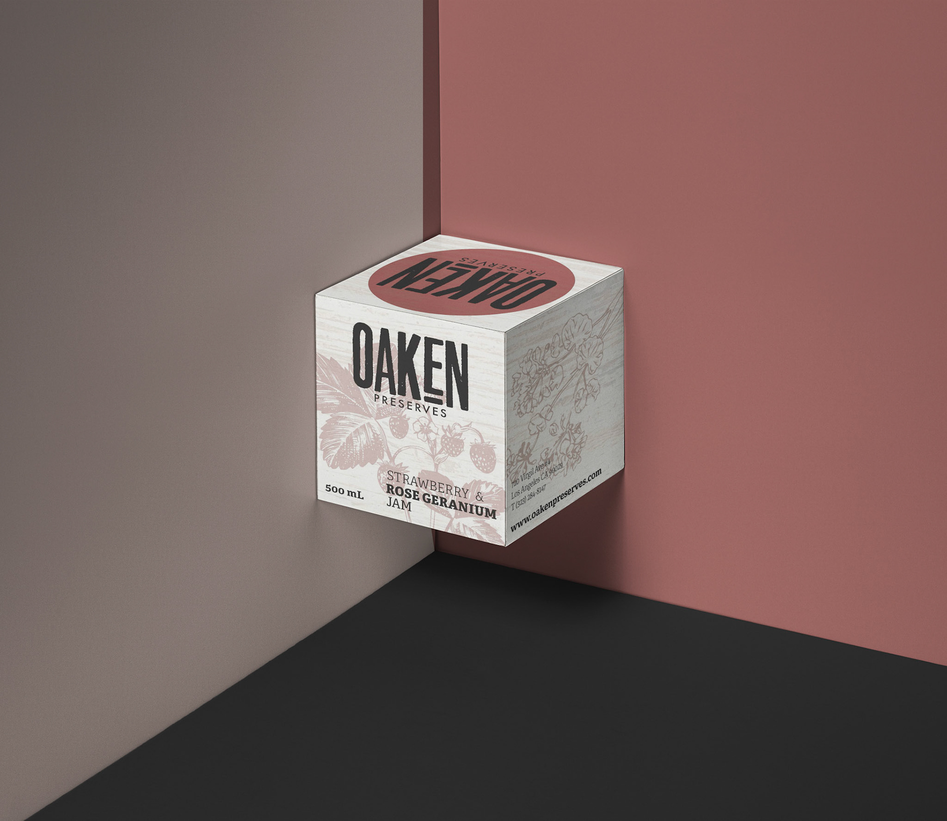
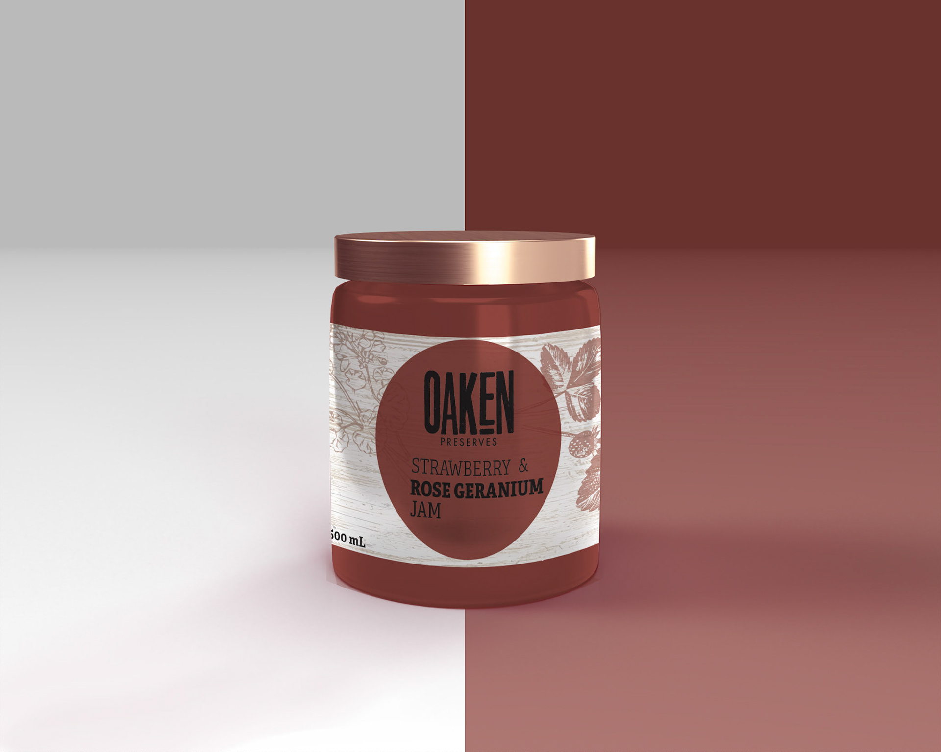
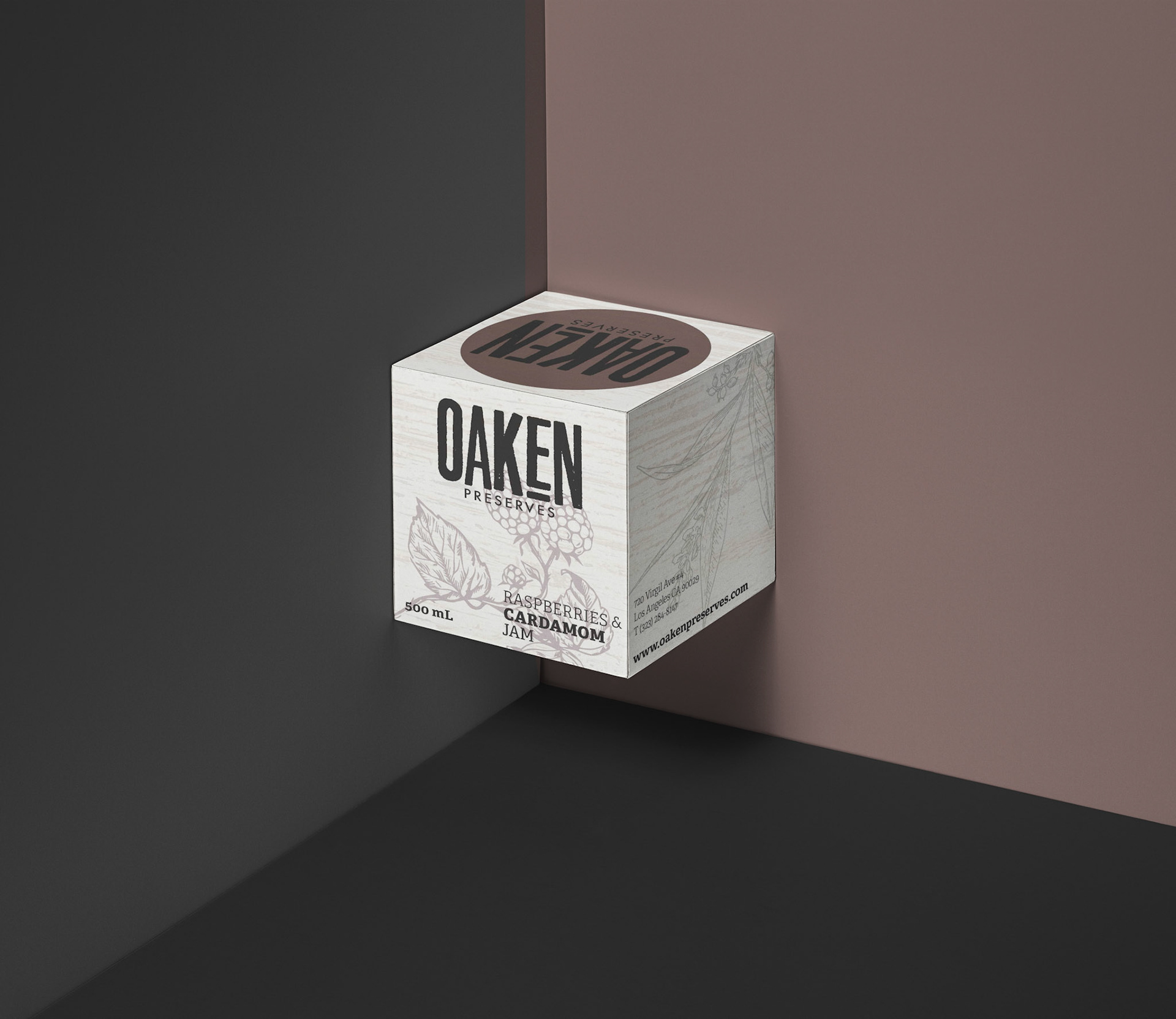
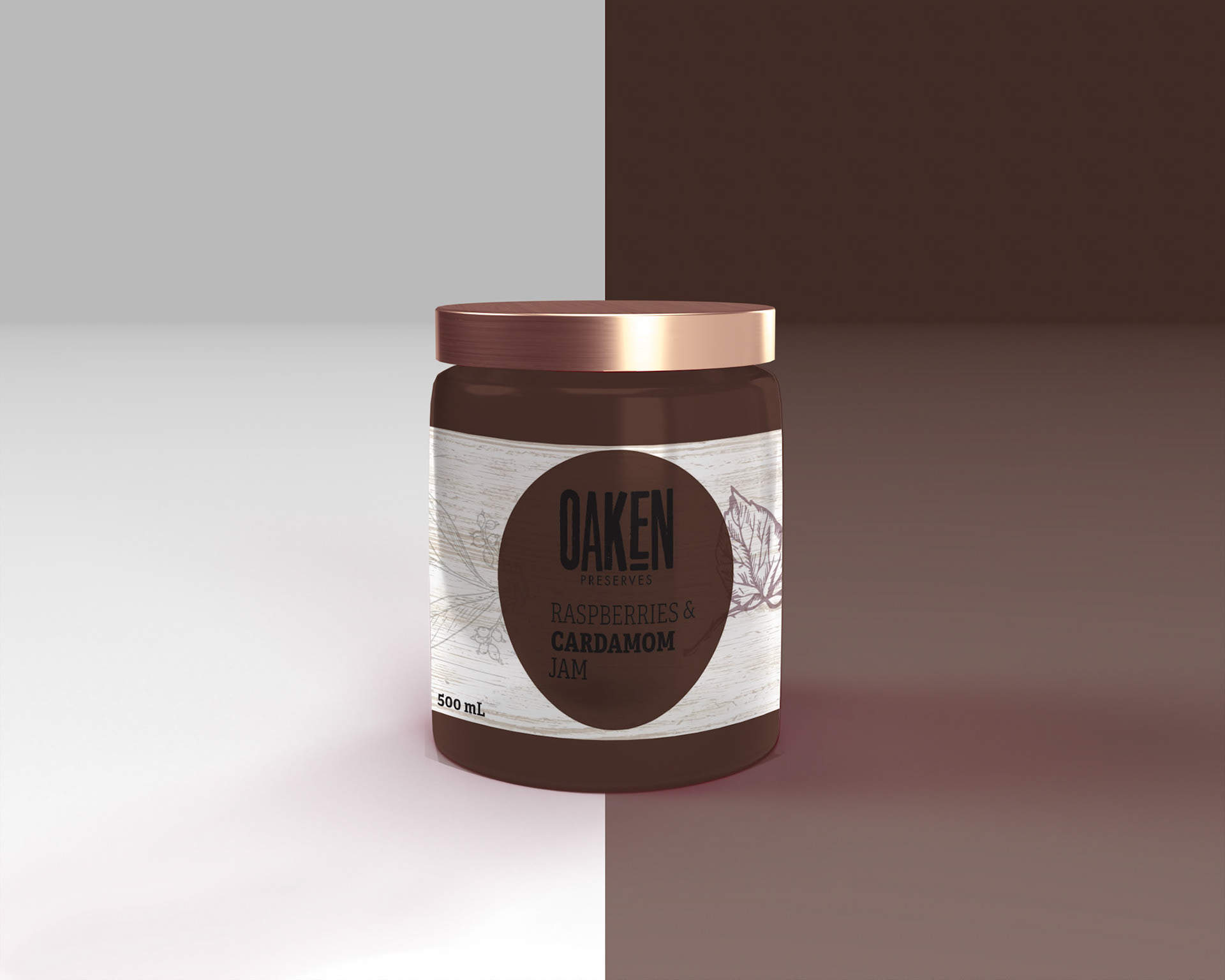
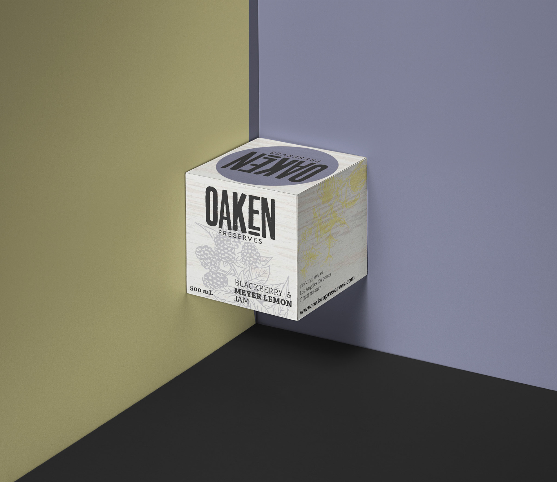
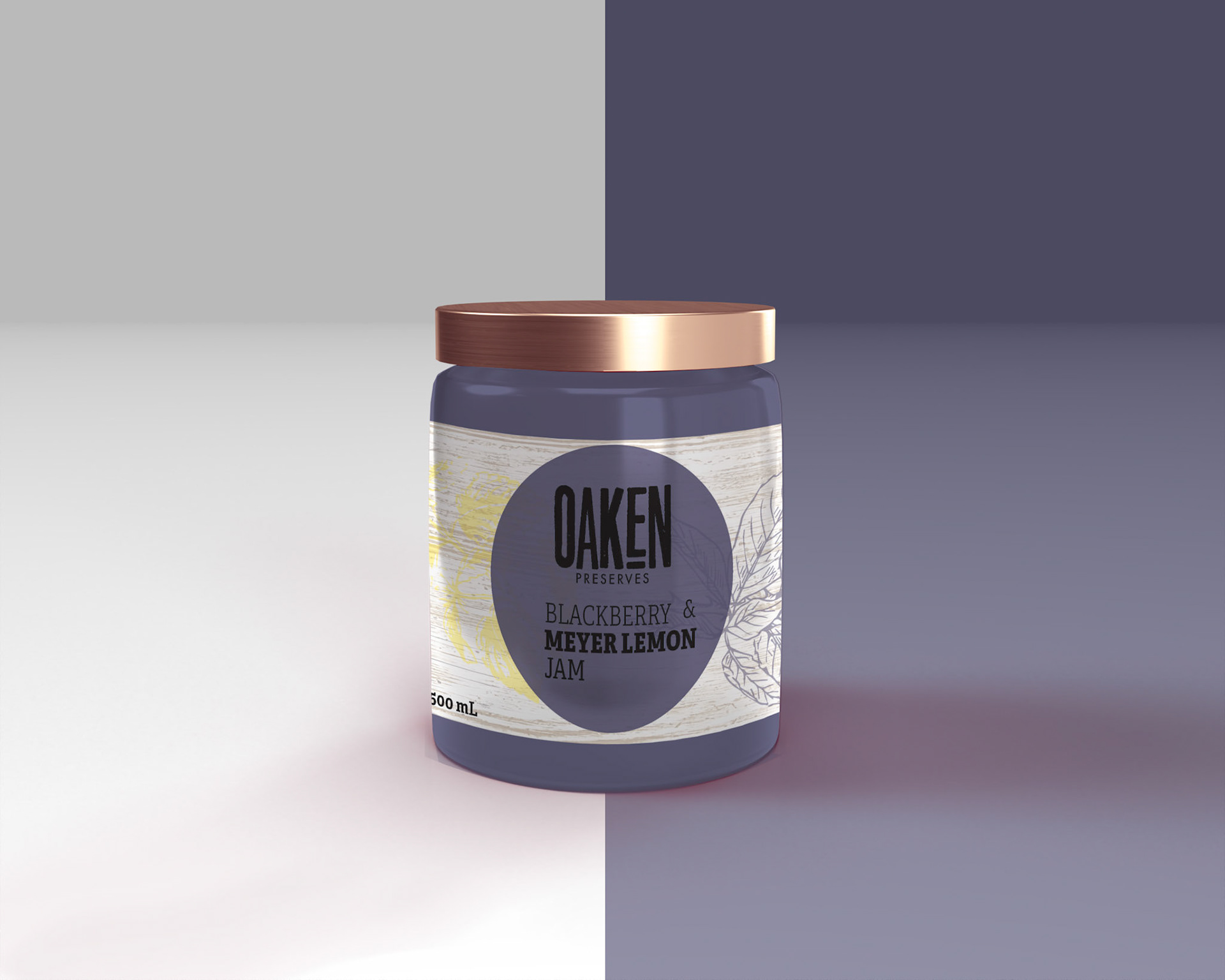
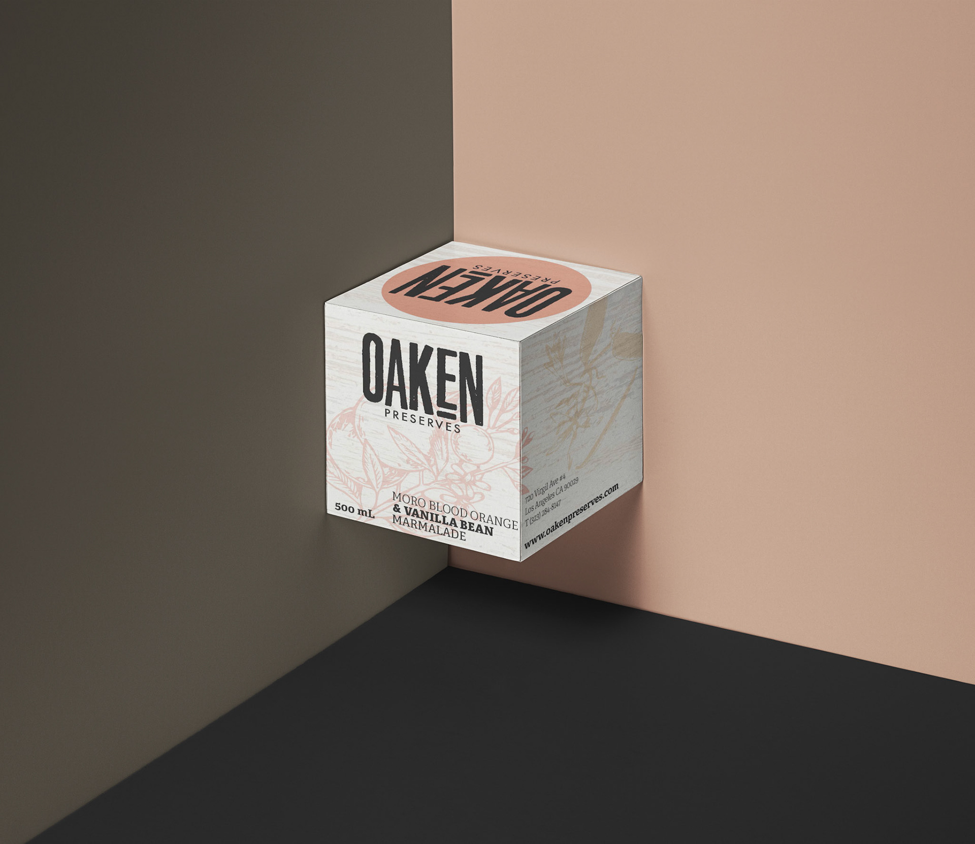
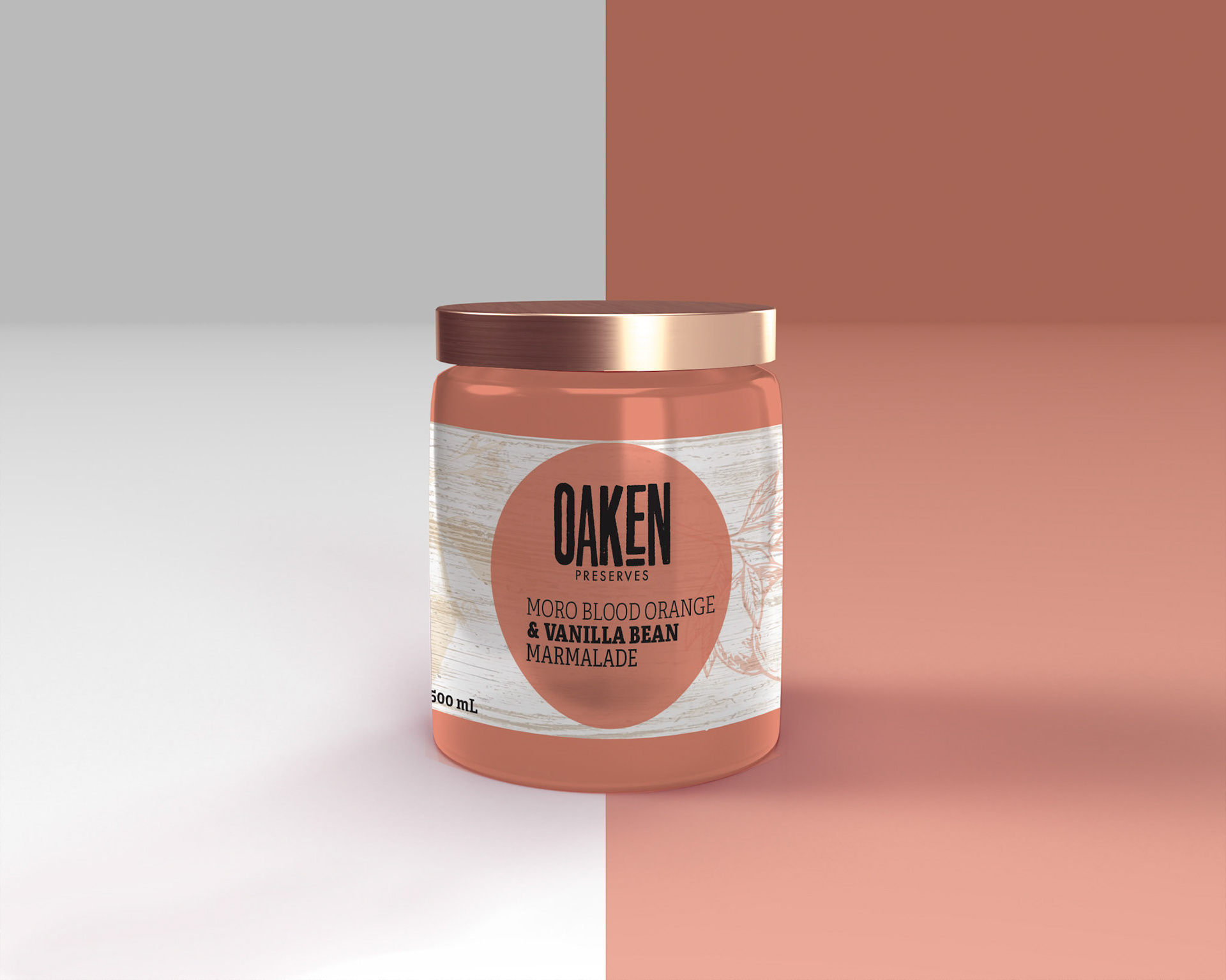
Oaken Preserves is a jam company that I tasked to design for my packaging class, I wanted the design to be minimal yet enticing for any consumer.
I've chosen a light wood grain and botanical graphics for the boxes and labels as a design and stuck with a neutral colour palette throughout, I wanted each packaging to be cohesive to each other for display purposes.
I've chosen a light wood grain and botanical graphics for the boxes and labels as a design and stuck with a neutral colour palette throughout, I wanted each packaging to be cohesive to each other for display purposes.